Where
Purpose

meets Design!
At Danchie, we're a brand-driven creative agency bringing diverse talents together to craft cross-disciplinary solutions for brands.
At Danchie, we're a brand-driven creative agency bringing diverse talents together to craft cross-disciplinary solutions for brands.
/
Featured projects
Decarbonize the built environment
China, 2022
Digitalize to decarbonize
China, 2022
Turn on the summer
China, 2024

Unexpected
China, 2018
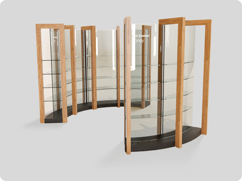
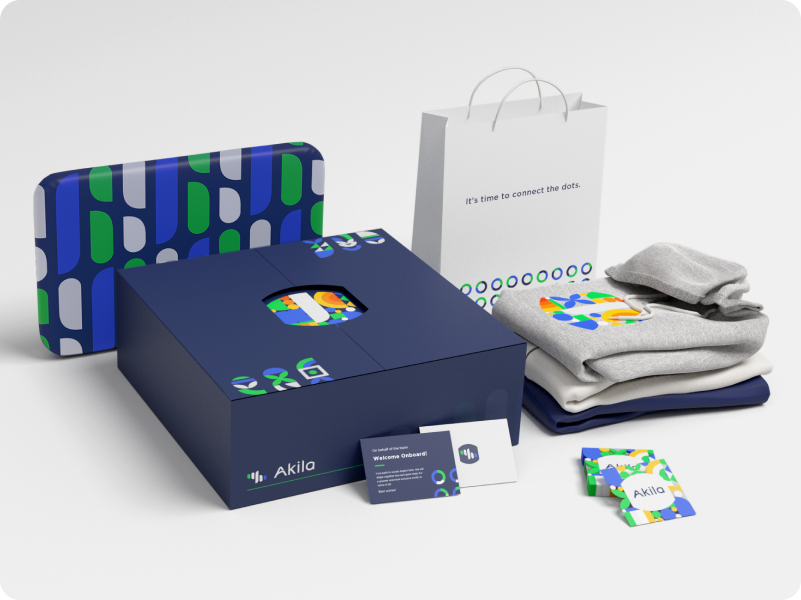
Kia ora!
China, 2018
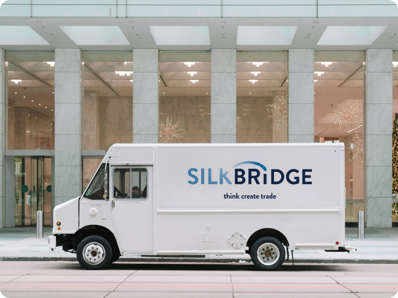
Industrial solutions
China, 2022
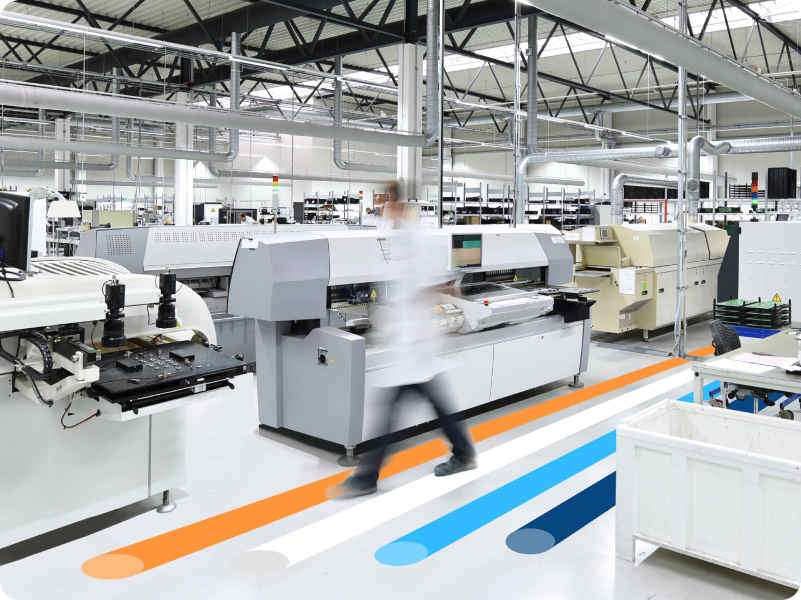
Professional electronics manufacturer
China, 2018
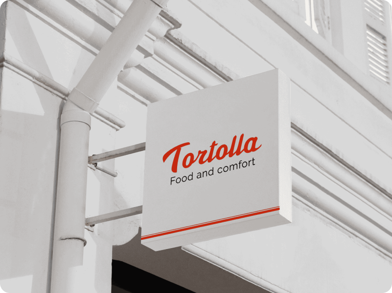
Food and comfort
China, 2022

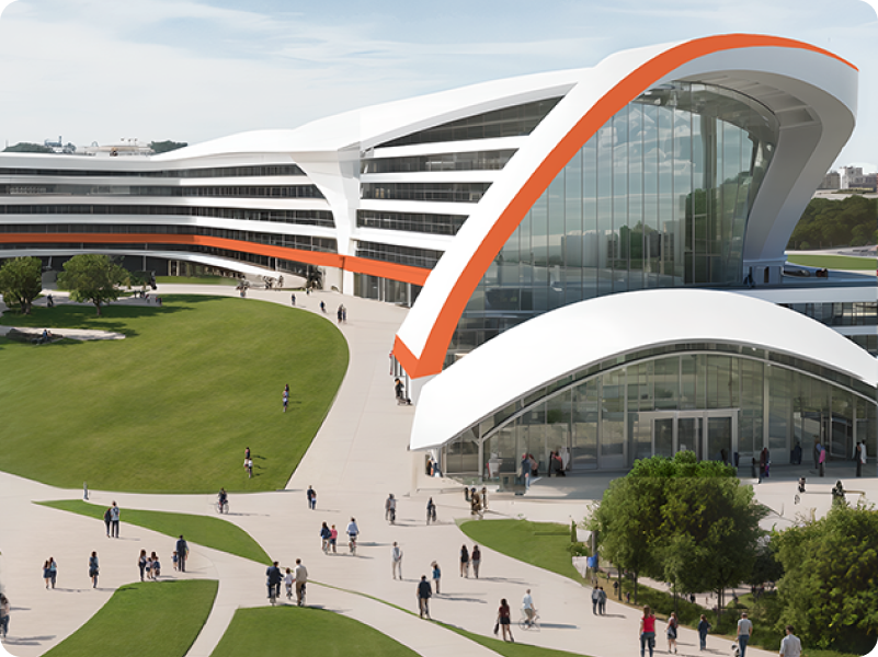
A space for people
China, 2022

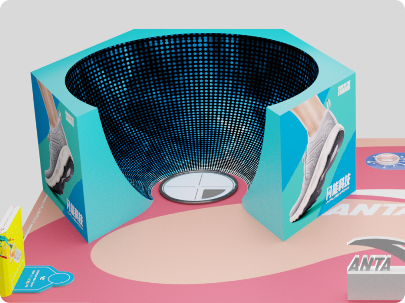
Showcasing innovation
China, 2022
1 / 0

/
What we do
We offer thoughtful
solutions for
your brand
We focus on delivering brand consultancy and tailor-made solutions. From shaping brand strategy to designing unique identities and creating memorable experiences, we help brands grow, engage, and stand out.
More about us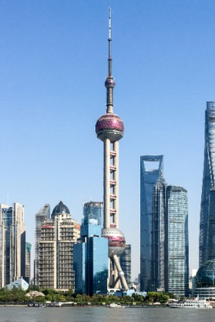

Shanghai/China
Our Shanghai office sits in the heart of the city, working closely with brands and partners across Asia to bring creative ideas to life.
Lisbon/Portugal
From our cozy space in Lisbon, we connect Asian and European perspectives, bringing together different creative approaches and cultural insights.
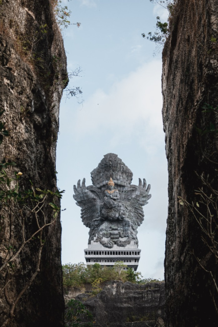
Denpasar/Bali
Our Bali studio offers a fresh take on creativity, where our team draws inspiration from the island's unique energy to develop distinctive brand solutions.