Danchie was asked by Anta to design a gamified pop-up store that was easy to set up and reuse. The creative direction had to be based on the client’s Flashfoam technology for cushioned running shoes.

With limited available space for the pop-up store, our challenge was to devise original concepts for games that could generate brand awareness.

Our first game consisted of a synchronized tap dance based on the concept of bounce and rebound, with correct movements causing LEDs to spiral and reach the top of a curved screen.

This was a fun and interactive experience that served to showcase the engineering of the shoes.
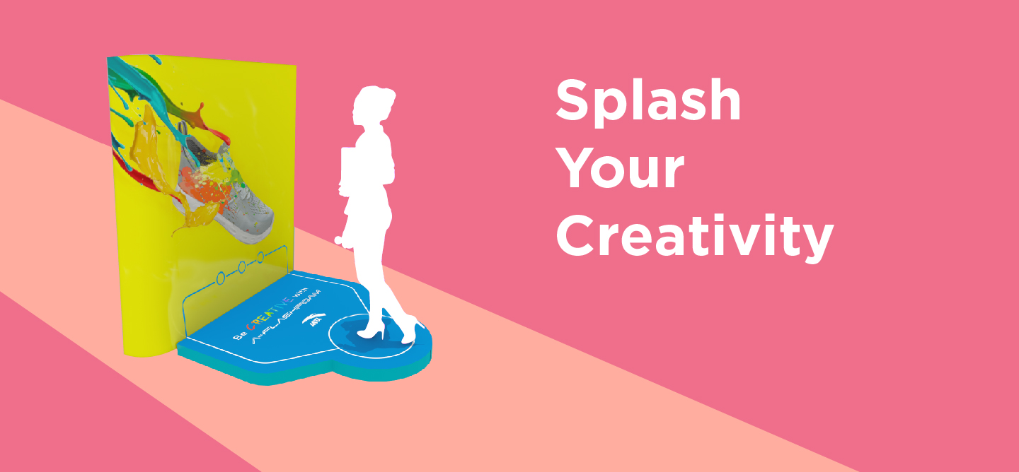
For the customers who were less interested in dynamic sports, we conceptualized an activity for an interactive screen in which a virtual brush was provided for painting and personalizing shoe boxes.

Both games were branded according to the campaign requirements.
Jenny Yang, an image consultancy based in Hong Kong and mainland China, wanted to update its brand and develop a new set of products.

After taking the time to understand the company, Danchie concluded that the brand was already heading in the right direction but that some adjustments were necessary to achieve aesthetic cohesion.

Danchie proposed a design strategy aligned with the clients’ ideas.

the result was a set of three gift boxes and vouchers, each of which represented a clearly defined service package in terms of the level of formality.

Our design was mainly focused on the offline strategy of the brand. We were in charge of all process: from conceptualization, design and printing.

Our client requested a childcare brand that was friendly, visually strong, and aligned with its niche market.

Our challenge was to create a brand that could be extended to four products without losing the focus on “Fritzchen”.

We segmented the products by varying the colors and icons of creatures which we gave human qualities.

Ocean blue was the main color for the brand, and the extended brands featured saturated colors with full and round imagery.

The result was a brand that was clean and friendly, but also evocative of a strong German personality.

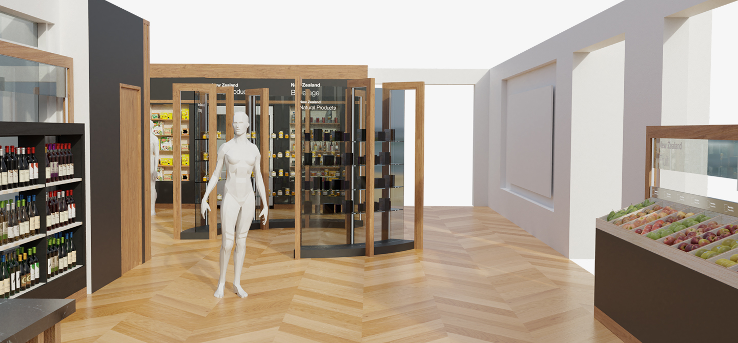
New Zealand Central in Shanghai wanted an exhibition space in their facilities to accommodate various products from New Zealand.

The client wanted the exhibition to follow its brand guidelines and asked us to think carefully about how the space would be divided in different areas with different products. Aligned with the client’s clean graphic language, Danchie proposed three distinct styles for the space.

Based on the theme of black and wood, furniture was created and adapted to each type of product and shelving. Honey and natural products were placed at the center of the space as a focal point.

Our structures took advantage of the positive and negative space, full and empty, black and white, giving priority to the source of light.

The space had its own natural wooden tone and texture, so our design was balanced with this. Our graphics were uncomplicated, and our table of contents was aligned with the visual strategy.

New Zealand was the inspiration for some vectors based on nature and geometrical shapes. The exhibition was a success, and the design was very well received.