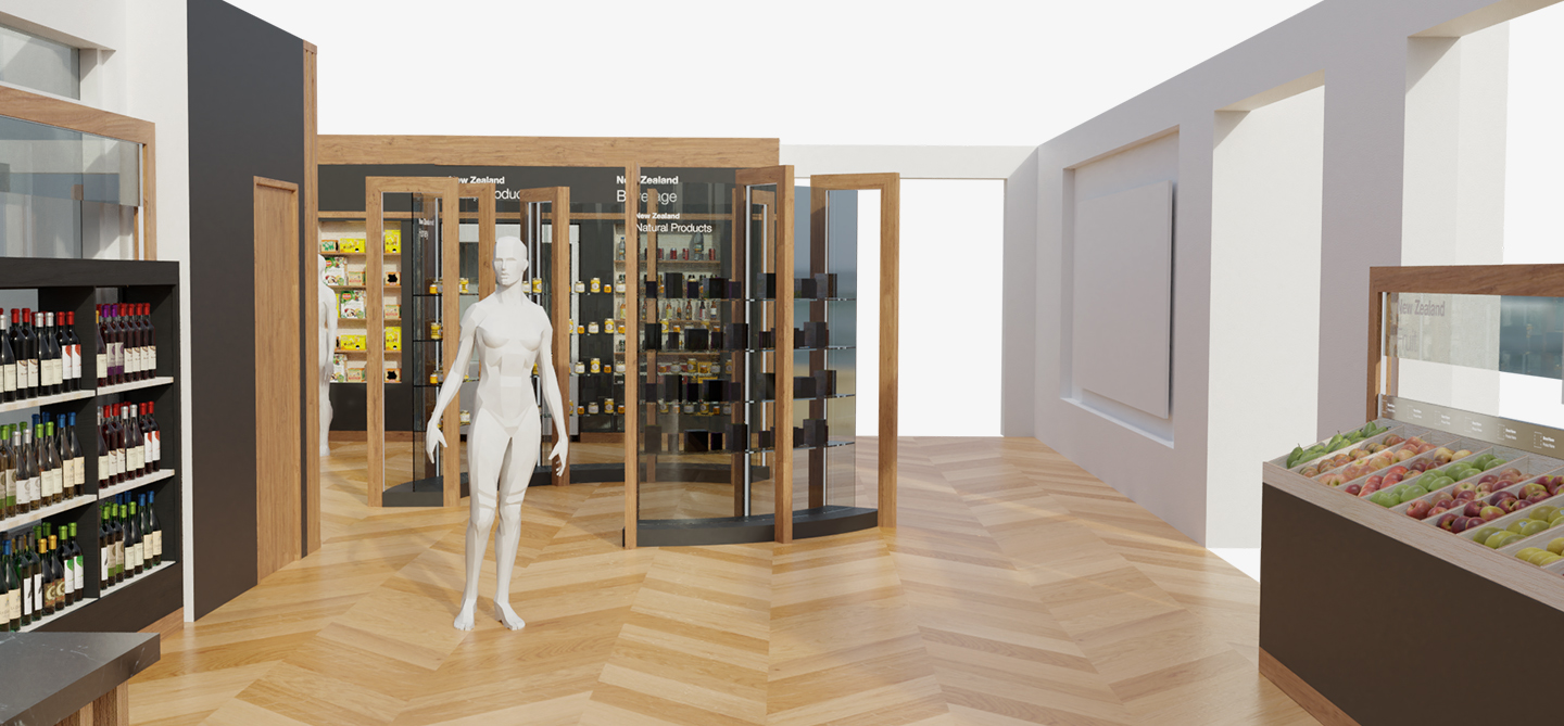
New Zealand Central in Shanghai wanted an exhibition space in their facilities to accommodate various products from New Zealand.

The client wanted the exhibition to follow its brand guidelines and asked us to think carefully about how the space would be divided in different areas with different products. Aligned with the client’s clean graphic language, Danchie proposed three distinct styles for the space.

Based on the theme of black and wood, furniture was created and adapted to each type of product and shelving. Honey and natural products were placed at the center of the space as a focal point.

Our structures took advantage of the positive and negative space, full and empty, black and white, giving priority to the source of light.

The space had its own natural wooden tone and texture, so our design was balanced with this. Our graphics were uncomplicated, and our table of contents was aligned with the visual strategy.

New Zealand was the inspiration for some vectors based on nature and geometrical shapes. The exhibition was a success, and the design was very well received.


